VisiQuate User Guide
Summer 2022
Summary
Since the first of this year, we’ve made a number of updates to our products that should help users be more efficient in how they interact with our products, enabled some updates in user management and put in some requested features. All of these capabilities are already available for you in your environments, so you may have noticed some of these already.
In addition, over the next couple of months we will be rolling out a revamped card view. Card View now offers a more user-friendly format of a consolidated suite of data about a patient’s account. Now you can customize the interface even more by taking advantage of the following set of enhancements:
- Panels resizing
- Tabs and columns dragging
- Rows reordering
- Vertical and horizontal grid resizing
- Sorting and filtering grids and much more.

New Features in Action Panel
This section describes how AP has been improved to bring users the best experience while working and taking advantage of all the available features.
Action Panel Stays Open
In Flo, the Action Panel can stay open while users select other or additional records in the grid. This will help users reduce the number of clicks to reopen the panel when selecting a new record.

In this new feature, Action Panel fields are updated automatically as the users select/deselect accounts on a grid.

Users see changes immediately without the need for additional clicks or reloading the page.

Changed the behavior of the Action Panel and Item History
Item History opens in the right-side panel
User can now open Item History in a right-side panel when only one account is selected and the Action Panel is closed or Worklist Options is open.

Note: When Item History is open as a right-side panel, the user can select a different Worklist item by clicking it. The previous item is automatically deselected and the history panel is reloaded with the contents related to the newly selected item.
Item History opens next to Action Panel
Item History now opens next to the Action Panel when only one account is selected and the Action Panel is open.

Note: When the user selects another Worklist item or deselects the currently selected item, Item History automatically closes.
Closing Item History
Now Item History closes If:
- The user clicks the Item History button while Item History is open.
- The user opens another panel.
- The user deselects the Worklist item.
- The user selects one more Worklist item by selecting its check box.
We have updated the Timeline Details panel which allows users to show compact history, standard history, or expanded history by selecting radio buttons. Now the compact version shows users the field values instead of the field names.
| New contracted version | Old contracted version |

|

|
Filters Reset Grid and Action Panel
Currently if a user selects one or more accounts and then applies filters to the workflow grid, the accounts remain selected, even if they don’t qualify for the filters. In order to ensure a consistent experience and avoid potential issues of incorrectly updating accounts, the system will now unselect any accounts and close the action panel when filters are applied to the grid.

Saving Action Panel Changes
This new feature prevents the user from losing unsaved changes made in the Action Panel. Before closing the Action Panel with unsaved changes and making other changes in the worklist, a dialog window appears prompting the user to make a decision whether to save the changes made in the Action Panel.

Read-only Action Panel
Now users without permission to edit worklist items can view Action Panel fields and values in the read-only mode. This allows sites to grant users access to see the Action Panel and its fields for training, audit, or other purposes without allowing users to make changes if they shouldn’t do so.

Keyboard Navigation
In the Action Panel, users now can move between the fields using the keyboard. Press the Tab button to move down or the Shift+Tab buttons to move up on the panel.

|

|
Miscellaneous Features and Improvements
Grid View Filtering
We’ve made updates to how the grid view filtering works, as well as how the numeric and date fields display. These updates help ensure consistency in what users see, and how they can filter values.
The formatting of the grid view will now appear as:
| Column Type | Pattern | Examples |
| Numeric fields | Integer or decimal
Every three digits of the integer are separated by spaces The full stop is used to separate decimal digits '-' sign is used in negative values, no space between the sign and the number |
12 222
-12 222 12 222 222.22222 |
| Currency fields | 1. $ {full or abbreviated positive integer or decimal}
2. -$ {full or abbreviated positive integer or decimal} 3. {full or abbreviated positive or negative integer or decimal} '$' sign is used before the number w/ one space between the sign and the number |
$ 45.21
45.21 -$ 5 777.24 $ 1 189 777.22 |
| % fields | 1. {full or abbreviated positive or negative integer or decimal} %
2. {full or abbreviated positive or negative integer or decimal} '%' sign is used after the number w/o spaces between the sign and the number |
42
42.2% -42% |
| Date fields | mm/dd/yyyy | 05/02/2022 |
| Abbreviation Rules | ||
| Numeric fields | Integers
Numbers < 10 000 -> show a raw number (no spaces or symbols) Numbers >= 10 000 but <1 000 000 -> shorten using the 'K' symbol, on hover show the full value Numbers >= 1 000 000 -> shorten using the 'M' symbol, on hover show the full value The same applies to negative numbers |
12 000 or 12 222 -> 12K
120 000 or 120 222 -> 120K 1 200 000 or 1 222 222 -> 1.2M 12 000 000 or 12 222 222 -> 12M 120 000 000 or 120 222 222 -> 120M |
| Numeric fields | Decimals
Same as integers |
12 000 000.1 -> 12M |
| Currency fields | $ {abbreviated numeric value} | $ 120M
-$ 120M |
| % fields | N/A | N/A |
| Date fields | N/A | N/A |
And filtering in the grid view now accepts the following options:
| Column Type | Allowed filter values | Single Value Examples | Multiple Value Examples |
| Numeric fields (positive numbers) | 1. Full integer
2. Abbreviated integer (copied from the grid or in the format that matches values on the grid) 3. Full decimal 4. Abbreviated decimal (copied from the grid or in the format that matches values on the grid |
12222
12 222 12222.222 12K 1.2k |
12222,13 222,12222.222,1.7k,13 222 111,120M
|
| Numeric fields (negative numbers) | -{full or abbreviated positive integer or decimal} | -12222
- 12 222 -12K - 120M |
-12222,- 13 222,12222.222,1.7k |
| Currency fields | 1. ${full or abbreviated positive integer or decimal}
2. -${full or abbreviated positive integer or decimal} 3. {full or abbreviated positive or negative integer or decimal} |
$ 45.21
45.21 -$ 5 777.24 $ 1 189 777.22 - $ 120 M |
$ 45.21,45.21,-$ 5 777.24,- $ 120M,-$121m |
| % fields | 1. {full positive or negative integer or decimal}%
2. {full positive or negative integer or decimal} |
42
42% -42% |
42,43%,-41% |
| Date fields | 1. mm/dd/yyyy
2. {full or abbreviated name of the month} 3. {full or abbreviated name of the month} {year} |
05/02/2022
February Feb 2022 |
05/02/2022,Feb 2021,February2020 |
DMA and PayFlo Content Updates
- New EOB Lookup table - Our team has updated the EOB lookup table to utilize both CARC and RARC codes to drive denial sub-type and a new opportunity rank field (replaces the opportunity percentage).
- Opportunity Rank can be used to replace the opportunity percentage field. The new field utilizes just high/medium/low to provide directional guidance and is based on a review of data aggregated from across client sites by our denial experts. The move to a 3-tier rank vs a percentage was made because the percentages were generally grouped to just 3 values, and it was felt they were overly specific.
- All standard codes (revenue, CPT/HCPCs, CARC, RARC) were updated to the latest standards
- Standard fields were added for low dollar, low opportunity, and RARC hierarchy. Logic was updated for high dollar flags, payment variance (previously underpaid) amounts and flags.
- Additional logic was embedded within the CARC Hierarchy lookup so it includes RARC as well as denial opportunity and complexity, in addition to the dollar amount.
- Please work with your account manager and support team to take advantage of these changes. Review will be required to merge any EOB lookup customizations that have been done for your site with the updates that have been made to our standard
User Management
For users that have access to the user management features within Visiquate, the following changes have been made.
User Creation and Activation Date
When editing user account, you can now see additional information: the date of account creation and the most recent date when the account was activated.


To view this information:
- Open the User Management window from the top-right User menu.
- Right-click a profile and select Edit.
In the opened window, information about the creation and activation of a user is displayed.
Note: Some profiles may contain only the creation date.
Indication of Deactivated Users
Added better indication of deactivated users, which is now available in the Edit Users dialog window.

To view this information:
- Open the User Management window from the top-right User menu.
- Select the Deactivated Users check box and right-click a profile.
In the opened Edit Users dialog window, information about user deactivation is displayed.
Avatar Error Message
When editing a user profile, an error message is now shown if an avatar is bigger than 5 MB.

Improved Performance of Report Tree
The report tree accessible from the Reports menu on the left panel has improved. In order to speed up content loading, the system now loads it in parts per user request instead of loading all folders and elements at once. That means that the content in folders is loaded when you open that folder. This way, you see high-level folders immediately without waiting for all the content to be loaded.

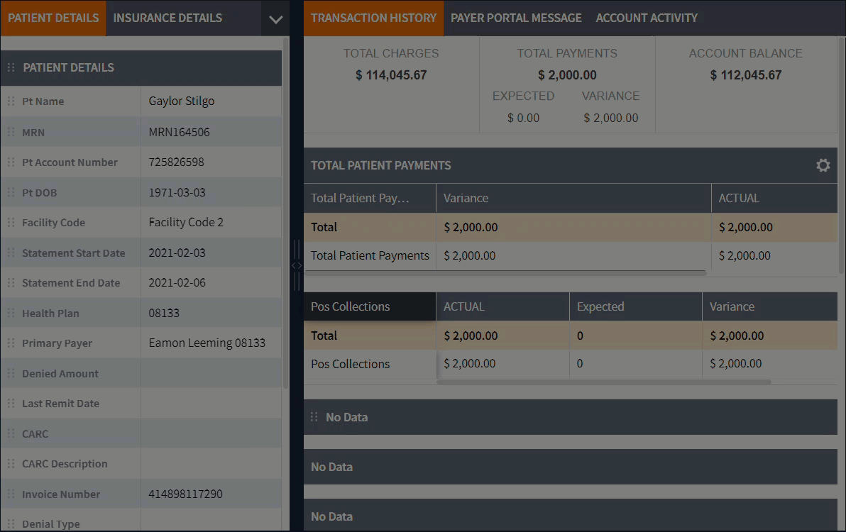
New Features in CardView
This section describes how CardView has been improved to bring users the best experience while working and customizing the app to suit their needs.
Resizing Panels
This feature allows adjusting the size of panels by dragging the boundary of panels left or right. This improves the readability of the content presented in each section.

Dragging Tabs
This feature allows users to reorder tabs on the panel by dragging them. This helps move tabs around to create the most efficient working environment.

Selecting Tabs
This feature allows user to open the drop-down menu (2) that lists all the tabs present in the current section and then make a selection.

Vertical Grid
This section lists improvements that bring users the best experience while working and customizing the Vertical Grid.
Resizing Vertical Grids
This feature allows adjusting the size of columns to free the widget’s working space. For example, this allows users to minimize the names column to better see the values column.

Patient Information Widget
This widget displays the patient’s full name and additional information about such values as gender, age etc., which is now pinned at the top of the main section even when the user scrolls down the grid.

Reordering Rows in Vertical Grid
This feature allows users to reorder rows in the vertical grid by dragging them up/down in the grid. This lets users group information in a more intuitive and task-oriented way.
The left alignment and formatting of names and values has improved visual representation for a user that works with the information in the vertical grid.

Horizontal Grid
This section lists improvements that bring users the best experience while working and customizing the Horizontal Grid.
Note: Horizontal grid options resemble Flo grid options.
Resizing Horizontal Grids
This feature allows adjusting the size of columns on the horizontal grid by dragging the boundary of the columns. This lets users view the content of the column in its entirety and minimize other columns.

Sorting Grids
This feature allows users to sort content in the grid by sorting content in a column. This allows users to arrange information in a way that helps them see critical data immediately. To sort the column, click the grid header.

Grid Options
This feature allows users to configure the grid by:
- Highlighting even rows to help users navigate in the grid while scrolling, searching, etc.
- Showing filters box. This feature is similar to the Flo filters except that in Card View users can hide filters to free the columns space. For details on filtering, refer to the section Filtering Grids.
- Specifying which columns to display in the grid. This feature lets users hide certain columns and work only with the columns that users need for the task at hand.
- Reordering the grid columns. This lets users group content in a more relevant way.

To open the Grid Options dialog box, click the button in the top right corner of the grid.

Filtering Grids
Data in the grid can be filtered using the filtering options displayed in the column header.
This option lets users find certain content and filter out the rest of the information.

Filter boxes can include configurations for dates, free text, or filter selections depending on the filter type.
To add the filtering options, click the Grid Option button in the top right corner of the grid and then select the Show Filters check box.
Note: In Flo, users cannot hide these filters through the Grid Option.
For details on all the filtering options, refer to the CardView user guide.
Dragging Columns
This feature allows users to reorder columns in the grid by dragging them. This customization lets users compare values and rearrange content to meet the tasks at hand.
Note: You can also reorder columns from the Grid Option menu. For details, refer to the section Grid Options.

Pinning Columns
This feature allows users to pin a grid column which helps in navigating the grid once you begin scrolling the grid left and right.

Dragging Widgets
This feature allows users to change the location of the grid widget within the panel by dragging it.

Multi-Grid Scrolling
This feature allows users to scroll through each separate grid or the entire panel that may include many grids. This helps users navigate and scroll through the widgets faster.

Collapsing/Expanding Widgets
This feature allows users to collapse and expand widgets by clicking the up/down arrow buttons. This functionality helps hide unneeded grid content.

Links to Additional Accounts
This feature allows users to drill down to additional Card View accounts by clicking the account number in the grid. This option lets users view other accounts without the need to return to the FLO grid.

Displaying Detailed Card in Account Activity
The detailed card dialog window displayed in the Account Activity tab on Summary Card View has been repositioned to avoid overlapping the Timeline Detail elements when users want to view all the information.

Restoring Default Layouts
This feature allows users to restore the Card View user interface to its default state.

User Custom Configuration
Each change a user makes in Card View is saved as the user’s custom preference.
This feature allows users to save customizations across all instances of one CardView.
Note: Customizations will not apply when a user opens a different CardView. These custom preferences are associated exclusively with the user who set them.
For details on CardView customizations that a user can save as custom preferences, refer to the CardView user guide.
Action Panel and Account Activity Synchronization
Now work-item history on the Account Activity tab is updated immediately after the user updates and saves the Action Panel. The user does not need to reload the page to view changes made to the account.

Closing Right Section
This feature allows users to close the right-side section to allow more space for the middle section. This feature is available regardless of the number of tabs in the section.

As a result, the user hides unnecessary sections to expand the working area.

Showing Rules Reprocessing Notifications
This feature allows users to see notifications about rules reprocessing in all opened tabs including Summary Card View and Forms.

These notifications are displayed in Card View as soon as a user clicks Reprocess in the Flo Rules grid.

We hope you enjoy the new improvements!
You can always let VisiQuate know your feedback at support@visiquate.com.